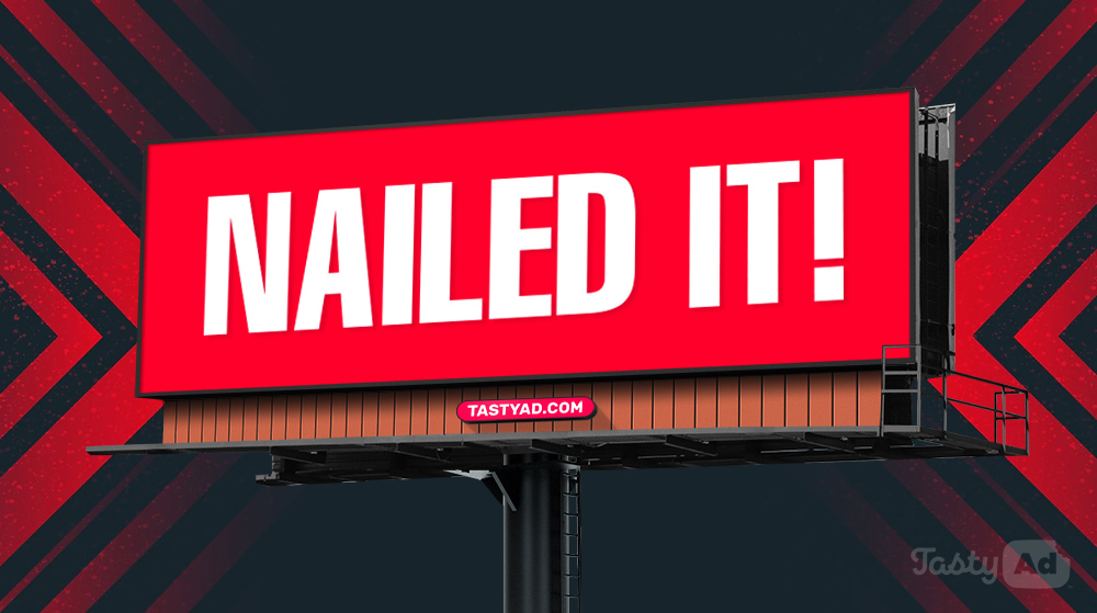
5 ways to make your billboard ads more effective

Looking for ways to make your billboard ads more effective? You’ve come to the right place! With over a decade of out of home advertising and billboard ad design under our belt, we’ve seen what works and what doesn’t. Below is our list of 5 things you can do to make your billboard ads more effective.
1.
Content is king in billboard design
The single most important thing you can do to improve a billboard ad’s effectiveness is to start with the headline and call to action. Don’t overthink it and know your ad’s goal before you start the design. Be short and decisive. What do you want the ad viewer to know and what do you want them to do?
Example: A billboard ad for car insurance:
Headline: Quality insurance at affordable prices.
CTA: Free quote (website)
2.
Color goes a long way with billboard design
The color you use has a huge effect on your billboard design’s effectiveness. Muted, dull, and earth-tone colors may be part of your advertiser’s branding, but they will have a negative effect on how many eyes are drawn to your ad. Bright and vivid colors draw the viewer’s eye to the billboard.
Don’t forget to have enough contrast between your colors for readability.
3.
Be funny or clever with your billboard headline
The most memorable ads (billboard, tv, radio, etc.) always tie into our human emotions. Tugging on the heartstrings of the viewer makes the ad more relatable and memorable. It also increases word of mouth.
4.
Reduce the contact information
Many billboard advertisers like to list a ton of contact information on their ads. Unfortunately for the viewer, this is too much information to take in and remember. A single contact element per ad is ideal, and in many cases, you don’t need any contact information at all. Phone numbers, unless formatted into words (1-800-INSURANCE) are not easily remembered.
Key takeaway: Most people will google the advertiser’s business to find their contact info.
5.
Use a bold image or photo
People like looking at ads with people on them. It’s relatable. A simple photo of someone using the advertiser’s product or service is ideal. As long as you can easily tell what the person is doing or using. If you can use an attention-grabbing image that still relates to the headline or advertiser’s business, even better!


