Before and After Billboard Photos

Having fantastic photos that show off your product or service is a MUST these days. Between LinkedIn, Instagram, Facebook, and Twitter, consumer interaction is a large part of getting your business out there. Photographs that truly catch your eye are going to provide you with more memorability and importantly, more engagement.

All photographers know that two of the more important factors when taking a good photograph are composition and light. Composition “describes the placement of relative objects and elements in a work of art.” 1 Light refers to the brightness of your light source (most likely the sun), time of day, and settings on your camera. However, all of this is easier said than done when you’re racing against time with the sunlight and weather, as well as trying to find the best angles to show traffic without getting hit by passing cars! This is where editing comes in.

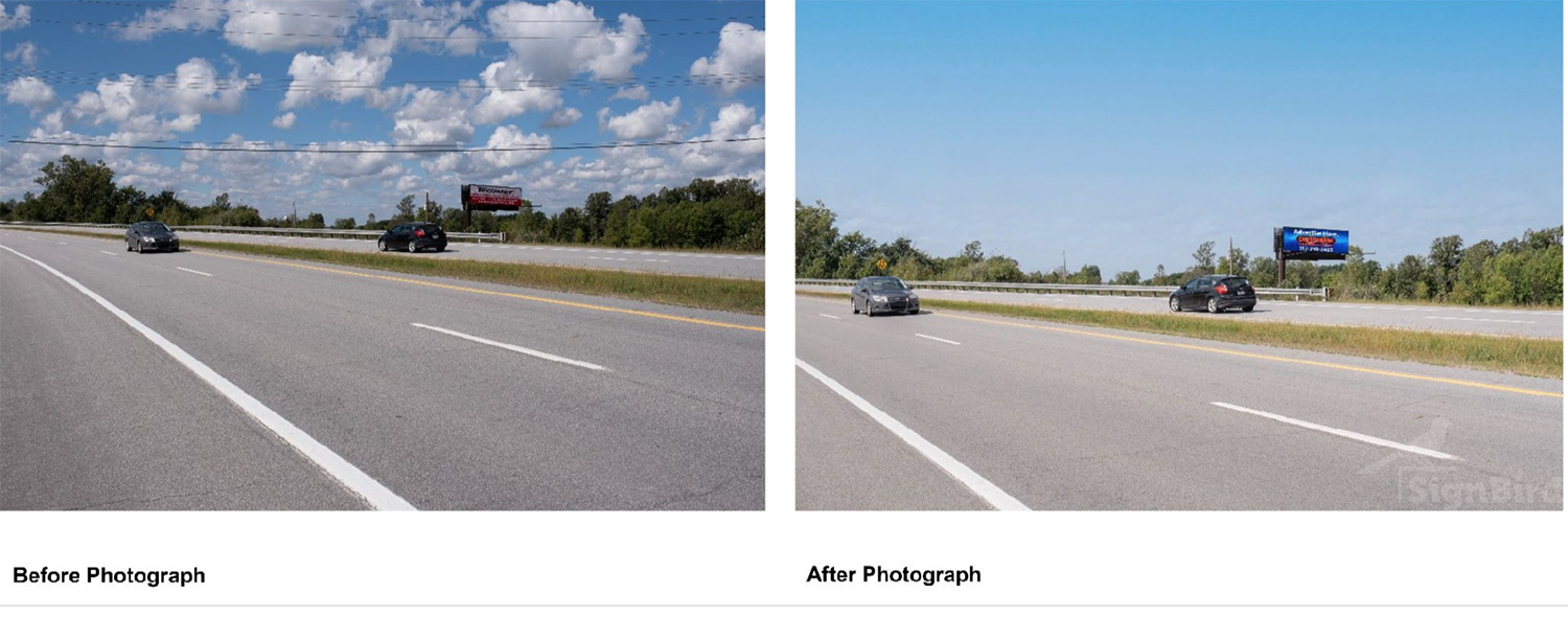
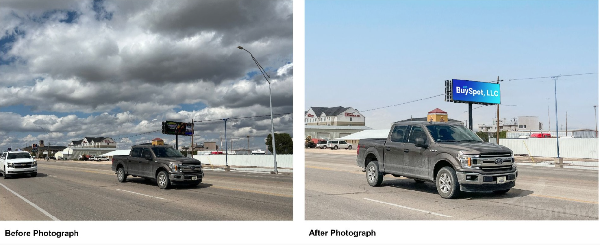
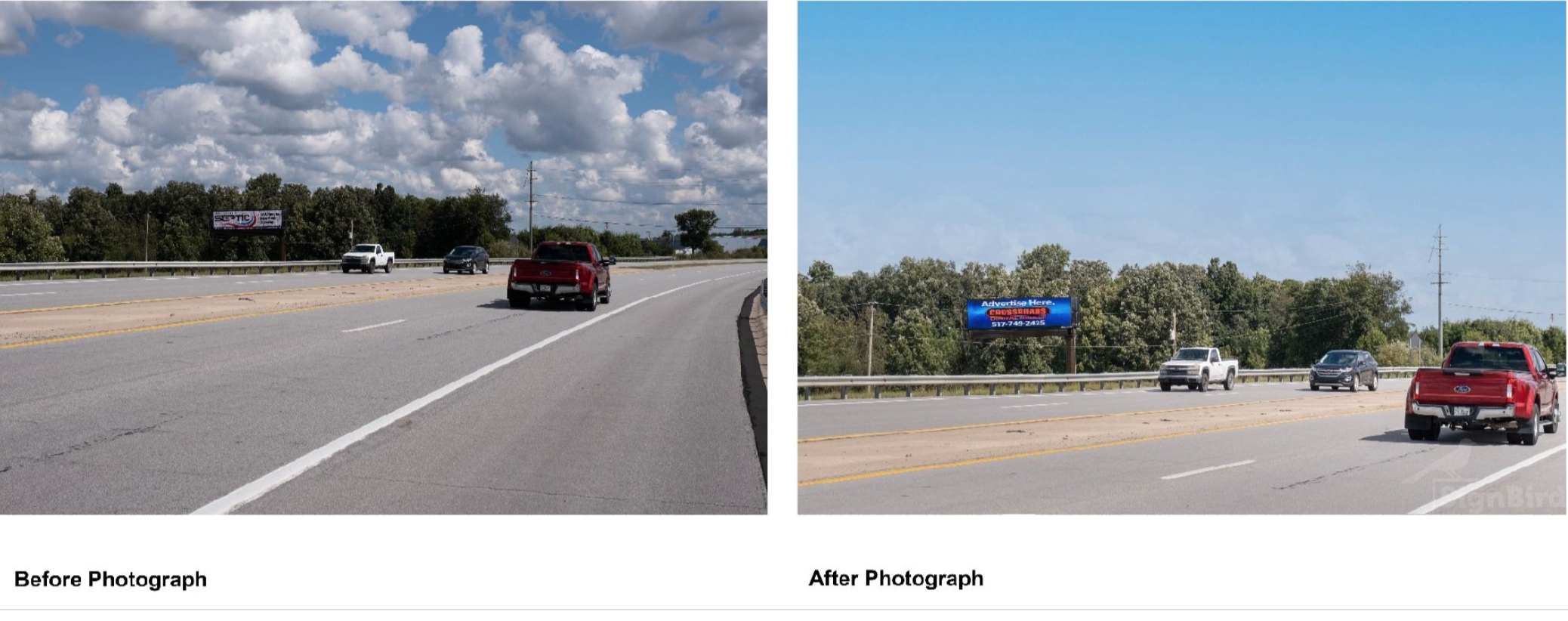
Here we have a before and after example of photographs taken for SignBird. The before photo has a lot going on and it’s very hard to read the billboard. The photo is darker than necessary and there are many distractions that take away from where we want your eye to go. In the after photograph, we’ve lightened the image, fixed the sky, cropped the image to reduce distractions, and fixed the composition, as well as inserted the ad copy. All of this together does a lot to draw your eye to the billboard! By using bright colors and clear text in the ad copy, cropping to better composition, as well as adding a plain sky in the background, you can focus on what’s important in the photo.

If you find that your photos look more like the before, take the time to edit them! Going that extra mile to show off your billboard space is what will catch your viewer’s eye and put you a step ahead of the competition.
Written by Jennifer Macquade, SignBird
1 Naryškin, Romanas. “What is Composition in Photography?” Photography Life, 11 February 2018, https://photographylife.com/what-is-composition-in-photography.

