Is Your Advertiser’s Logo Billboard Friendly?

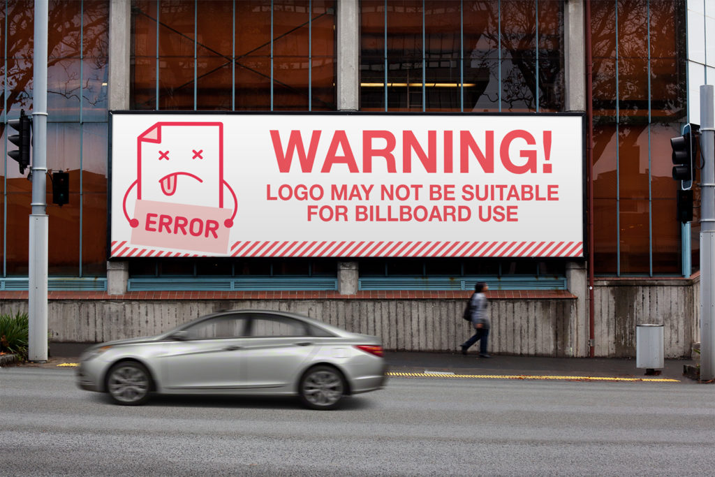
 As billboard providers, we want our advertiser’s creativity to be the best it can be. We want their phones to ring off the hook, for people to be lined up outside their stores, for their websites to burst at the seams with new visitors. We do everything we can to make sure the ads follow the best practices of billboard design. But what should we do when an advertiser’s logo is not going to work on a billboard? Sometimes the ad can be designed around the logo to ensure readability, but other times the logo should be abandoned and alternative methods recommended to the advertiser.
These can be murky waters to tread through as telling an advertiser their logo isn’t great can lead to hurt feelings and angry customers. Perhaps they designed it themselves and absolutely love it. They spent days working on it and got approval from their friends and family. After all, everyone is a “designer” these days. That being said, if we carefully suggest the following alternatives, we can help ensure maximum ad impact and hope for renewal after their billboard agreement ends.
One option is to use the logo on the ad, even though it may be unreadable, and add a line of text to the ad with the business name large and readable. Suggesting to the advertiser: I’m worried the text in the logo may be too small to read so we added your business name in a large legible type next to it. If their website is on the ad, and it is simply their company name with a .com at the end, we can make it large and legible and achieve the same goal.
Another option is to suggest the logo be left off of the ads to make the rest of the copy larger. Offering instead, to use a similar typestyle and color scheme as what is in the advertiser’s logo. Again, being delicate in your suggestion as to not upset the advertiser. Noting 7 words or less, simple artwork, and clever ideas are what make great billboard ads.
You could also suggest, if the advertiser has no logo or it is obvious they are not proud of their current logo, to have a logo professionally designed. Chances are, if they are a small business, it’s just something they never really thought about doing until now. At Tasty Ad, we design logos as well and we’d love to help. Check out this logo we did for Dail Digital, and this logo for Hicks Outdoor.
At the end of the day, the customer is paying for the billboard and the customer is always right. Even when they are wrong. So all we can do is make suggestions with the advertiser’s best interest in mind and hope they take our advice. Happy billboarding!

