Why It’s Great – Nick’s Restaurant Billboard Campaign

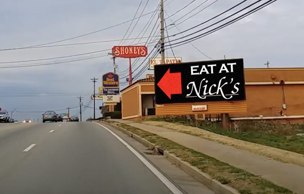
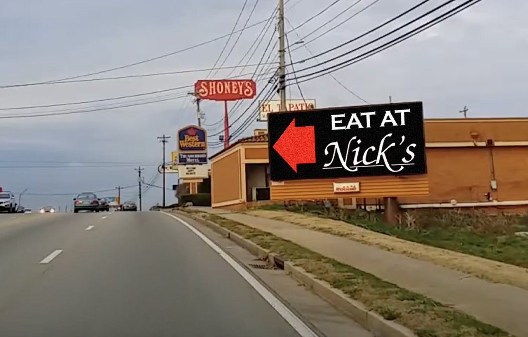
Can you say “Less is More”? There aren’t many billboard campaigns in the world that can get away with only 3 words and still be effective, however, this one pulls it off. Nicks Restaurant, located across the street from the pictured billboard, took the advice of their advertising partner at Roland Digital Media and had a great campaign run. Another great feature of the billboard ad is its simplicity of color. Easy-to-read text with good contrast and a huge red arrow to grab your eye.

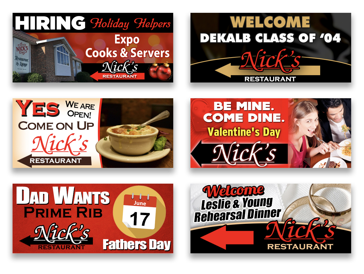
Their billboard campaign featured this simple 3-word ad (EAT AT NICK’S) as well as some other self and PSA announcements as seen below:

It’s good to remind ourselves that we can accomplish big things with just a little information in out-of-home.
See more What Makes it Great articles here.


